(Source: http://www.aiga.org/guide-whatisgraphicdesign) 20/05/2014
The nineteenth century was a rather busy time in the world. It saw the rise of the British Imperial Empire; the newly formed United States was just one of the British settlements that began developing in this century, with many others springing up on other continents. Invention and discovery swelled as the byproducts of the previous century’s age of enlightenment, and resulted in the urbanization that took place. With everything that was going on in the world, it makes sense that so many different types of art were gaining momentum. Three of the major art movements of this period were Neoclassicism, Romanticism, and Impressionism.
Neoclassicism:
Paintings created in the Neoclassic style reflect the rational way of thinking that was a significant part of the Enlightenment of 18th century Europe. This intellectual movement emphasized reason and drew from classical Greek and Roman style and content. Art that is considered part of the Neoclassicism movement can be identified by its idealized forms and stable composition.
This work, displayed on the fourth floor of the Walters, is by Lawrence Alma-Tadema and is called Sappho and Alcaeus. There are several characteristics of this painting that classify it as a Neoclassical work. Most obviously, the influence of classical Greece is evident in the subject matter with the portrayal of a scene from a passage by ancient Greek poet Hermesianax. Classical influence extends beyond the subject matter as well. The idealized, statuesque figures are deliberately arranged with strong linear organization.
Conversely, the art from the Romanticism movement was based on emotion rather than rationale, and placed an emphasis on the individual rather than on society. These works are characterized by a brighter use of color and expressive brushstroke, and were meant to evoke emotion. Exotic subjects from foreign lands were also more prevalent in Romantic art, and the Walters houses several works from this period containing these subjects. Eugene Delacroix, an artist known for his work in the Romanticism style, has a place in the Walters collection. The work shown below, called Collision of Moorish Horsemen, is a good example of several characteristics of this type of art. The subject is a reflection of the excitement of Eastern culture. Furthermore, the action in the painting is delineated by rapid brushstrokes, and there is an emphasis on color. Compare this painting with Sappho and Alcaeus shown above; do you see any other major differences between Neoclassicism and Romanticism that are evident in these two paintings?

Within the context of Romanticism, the Barbizon School of artists gained momentum in the middle of the 19th century and propelled painting towards realism and an increased emphasis on images of nature. Rather than serving as a backdrop, scenes of nature increasingly became the subject of paintings. The name “Barbizon” is derived from the French village where many of these artists gathered. Theodore Rousseau is known to be one of the leading artists of the Barbizon School; below is one of his works that is found on the fourth floor of the Walters Art Museum.
The tranquility that is shown in the painting is meant to be an expression of how Rousseau was feeling when looking at this scene. What emotions does this work evoke for you? Compare this with the emotions that are evoked when looking atSappho and Alcaeus.
Impressionism:
The Romanticism movement was the forerunner to the Impressionist movement which, at the time, was a group of radical artists breaking the traditional standards of painting. Named for Claude Monet’s Impression, Sunrise, this type of painting was characterized by loose, quick brush strokes, a focus on one’s immediate impression of a scene, elimination of chiaroscuro, and painting “en plein air,” or outside.

Futurism
Futurism was an art movement launched by the Italian poet Filippo Tommaso Marinetti in 1909. On 20 February he published his Manifesto of Futurism on the front page of the Paris newspaper Le Figaro. That moment saw the birth of the Futurists, a small group of radical Italian artists working just before the outbreak of the First World War.
Among modernist movements, the Futurists rejected anything old and looked towards a new Italy. This was partly because the weight of past culture in Italy was felt as particularly oppressive. In his Manifesto, Marinetti asserted ‘we will free Italy from her innumerable museums which cover her like countless cemeteries.’
What the Futurists proposed instead was an art that celebrated the modern world of industry and technology: ‘We declare … a new beauty, the beauty of speed. A racing motor car … is more beautiful than the Victory of Samothrace’ (the celebrated ancient Greek sculpture in the Louvre museum in Paris). From an original blend of elements of Neo-Impressionism and Cubism, the Futurists created a new style that expressed the idea of the dynamism, energy and movement of modern life. The chief artists were Giacomo Balla, Umberto Boccioni, Carlo Carrà, Gino Severini and Luigi Russolo.
Tate Modern celebrates the centenary of this dramatic art movement with a ground-breaking exhibition. Here you’ll see the work of the Futurists accompanied by rooms looking at art movements reacting to Futurism, including Cubism, the British art movement Vorticism, and Russian Cubo-Futurism.
Highlights include Boccioni’s dynamic bronze sculpture of a man which seems to leap through thin air, Picasso’s Head of a Woman, Nevinson’s Vorticist masterpiece Bursting Shell, and works by major artists such as Braque, Leger,Malevich, and Duchamp.
(http://wamtac.wordpress.com/art-history/19th-century-art/) 20/05/2014
Who Created moveable type
Johannes Gensfleisch zur Laden zum Gutenberg 1395 – February 3, 1468) was a German blacksmith, goldsmith, printer, and publisher who introduced printing to Europe. His invention of mechanical movable type printing started the Printing Revolution and is widely regarded as the most important event of the modern period. It played a key role in the development of the Renaissance, Reformation, the Age of Enlightenment, and the Scientific Revolution and laid the material basis for the modern knowledge-based economy and the spread of learning to the masses.
Gutenberg was the first European to use movable type printing, in around 1439. Among his many contributions to printing are: the invention of a process for mass-producing movable type; the use of oil-based ink and the use of a wooden printing press similar to the agricultural screw presses of the period. His truly epochal invention was the combination of these elements into a practical system which allowed the mass production of printed books and was economically viable for printers and readers alike. Gutenberg's method for making type is traditionally considered to have included a type metal alloy and a hand mould for casting type.
In Renaissance Europe, the arrival of mechanical movable type printing introduced the era of mass communication which permanently altered the structure of society. The relatively unrestricted circulation of information — including revolutionary ideas — transcended borders, captured the masses in the Reformation and threatened the power of political and religious authorities; the sharp increase in literacy broke the monopoly of the literate elite on education and learning and bolstered the emerging middle class. Across Europe, the increasing cultural self-awareness of its people led to the rise of proto-nationalism, accelerated by the flowering of the European vernacular languages to the detriment of Latin's status as lingua franca. In the 19th century, the replacement of the hand-operated Gutenberg-style press by steam-powered rotary presses allowed printing on an industrial scale, while Western-style printing was adopted all over the world, becoming practically the sole medium for modern bulk printing.
The use of movable type was a marked improvement on the handwritten manuscript, which was the existing method of book production in Europe, and upon woodblock printing, and revolutionized European book-making. Gutenberg's printing technology spread rapidly throughout Europe and later the world.
His major work, the Gutenberg Bible (also known as the 42-line Bible), has been acclaimed for its high aesthetic and technical quality.
http://en.wikipedia.org/wiki/Johannes_Gutenberg 20/05/2014
Type Classification
Everyone knows their serifs and sans, slabs and scripts, but most classifications go much deeper than that. Type classification, while helpful, is often convoluted, confusing and even controversial. This article, distilling some of the complexities into a more understandable format, lands somewhere in the middle between the basics and genuine type nerdery —the perfect level for a practicing designer.
Why Classify Type?
There’s a certain intellectual delight in knowledge, particularly knowledge about one’s field of work and study. More importantly, perhaps, there is a way in which seemingly impractical knowledge of one’s profession lends more credence to the designer. That being said, what you’ll read here is by no means impractical. It really comes down to solid design choices.
A good grasp of type history will help you avoid typographic anachronisms, which, although often lost on the general public, do not escape the notice of many designers, as demonstrated in Mark Simonson's article on the 2012 Oscar winner for Best Picture, “The Artist,” and his other typographic scrutinies of popular movies and media.
It’s not exclusively about the history of type, however. Type classification is also helpful in pairing typefaces for projects, sometimes based on historical proximity but also by noting similar features that unify the typefaces, such as axis or x-height. In some cases, by finding enough disparity in the small features, very different typefaces become complementary.
Most importantly, perhaps, this article will not only familiarize you with general type history and commonly used terminology, but also help you learn to look for and recognize important characteristics of type and the inexhaustible minutiae that make typefaces unique, as well as arm you with useful descriptors of type styles.
Type Classification Systems
Over the past century, quite a few classification systems have been proposed. Most are generally believed to be subjective and incomplete, and many of them use the same terms for similar but slightly different classes. The impossibility of a truly complete classification system has led many people to dismiss any attempt to classify typefaces — there are simply too many variables to make anything close to a practical, comprehensive system. Essentially, classification describes typefaces; it does not define them. It’s not inflexible, and is more of an aid than a rule. However, for the reasons given above, I believe there is value to be found in it. Below are a few examples.
The primary “official” classification system currently is the Vox-ATypI system. Originally put together in 1954 by Maxmilien Vox, it was adopted in 1962 by the Association Typographique Internationale (ATypI), which made a minor change at the 2010 conference (appropriately, held in Dublin) to include Gaelic as an extra category. It classifies typefaces in 11 general categories, with some subdivision. Its Wikipedia article provides an excellent overview.
The British Standards Classification of Typefaces, adopted in 1967, is also based on Vox’s original classification. It is slightly simplified and has remained essentially unchanged since its adoption.
Bringhurst, in his Elements of Typographic Style — perhaps the standard in typographic textbooks today — categorizes typefaces loosely after periods of art history; for example, Baroque, Rococo, Romantic, etc. A book designer himself, Bringhurst focuses on text typefaces and practically ignores display type.
Others are much more general. An early system by French typographer Francis Thibaudeau, which provided the base for Vox’s later more thorough classification, includes four broad categories: Antiques (sans serifs), Égyptiennes (slab serifs), Didots and Elzévirs (faces with triangular serifs).
Gerrit Noordzij, while at the Royal Academy of Fine Arts in the Hague, held that typography was essentially an extension of handwriting, teaching typography using loose categories of letters that might be written with a broad-nib or pointed-nib pen, as well as interrupted or uninterrupted strokes, with varieties of both serifs and sans falling into each category.
These are just a few of the ways people have classified type over the years.In this two-part article, I will condense the various methods slightly and present what is at the very least generally accepted as legitimate (as there will always be a few out there who refuse to give up a particularly unusual classification method, or who decry any method at all).
http://www.smashingmagazine.com/2013/04/17/making-sense-type-classification-part-1/ 20/05/2014
Design Movements
The Arts and Crafts Movement was one of the most influential, profound and far-reaching design movements of modern times. It began in Britain around 1880 and quickly spread across America and Europe before emerging finally as the Mingei (Folk Crafts) movement in Japan.
It was a movement born of ideals. It grew out of a concern for the effects of industrialisation: on design, on traditional skills and on the lives of ordinary people. In response, it established a new set of principles for living and working. It advocated the reform of art at every level and across a broad social spectrum, and it turned the home into a work of art.
The Movement took its name from the Arts and Crafts Exhibition Society, founded in 1887, but it encompassed a very wide range of like-minded societies, workshops and manufacturers. Other countries adapted Arts and Crafts philosophies according to their own needs. While the work may be visually very different, it is united by the ideals that lie behind it.
This was a movement unlike any that had gone before. Its pioneering spirit of reform, and the value it placed
on the quality of materials and design, as well as life,
shaped the world we live in today.
The origins of the Movement
In Britain the disastrous effects of industrial manufacture and unregulated trade had been recognised since about 1840, but it was not until the 1860s and 1870s that architects, designers and artists began to pioneer new approaches to design and the decorative arts. These, in turn, led to the foundation of the Arts and Crafts Movement.
The two most influential figures were the theorist and critic John Ruskin and the designer, writer and activist William Morris. Ruskin examined the relationship between art, society and labour. Morris put Ruskin's philosophies into practice, placing great value on work, the joy of craftsmanship and the natural beauty of materials.
By the 1880s Morris had become an internationally renowned and commercially successful designer and manufacturer. New guilds and societies began to take up his ideas, presenting for the first time a unified approach among architects, painters, sculptors and designers. In doing so, they brought Arts and Crafts ideals to a wider public.
http://www.vam.ac.uk/content/articles/t/the-arts-and-crafts-movement/ 20/05/2014
Constructivism
A movement with origins in Russia, Constructivism was primarily an art and architectural movement. It rejected the idea of art for arts' sake and the traditional bourgeois class of society to which previous art had been catered. Instead it favored art as a practise directed towards social change or that would serve a social purpose. Developing after World War I, the movement sought to push people to rebuild society in a Utopian model rather than the one that had led to the war.
The term construction art was first coined by Kasmir Malevich in reference to the work of Aleksander Rodchenko. Graphic Design in the constructivism movement ranged from the production of product packaging to logos, posters, book covers and advertisements. Rodchenko's graphic design works became an inspiration to many people in the western world including Jan Tschichold and the design motif of the constructivists is still borrowed, and stolen, from in much of graphic design today.
http://www.designishistory.com/1920/constructivism/ 20/05/2014
The term Construction Art was first used as a derisive term by Kazimir Malevich to describe the work of Alexander Rodchenko in 1917. Constructivism first appears as a positive term in Naum Gabo's Realistic Manifesto of 1920. Aleksei Gan used the word as the title of his book Constructivism, which was printed in 1922. Constructivism was a post-World War I development of Russian Futurism, and particularly of the 'counter reliefs' of Vladimir Tatlin, which had been exhibited in 1915. The term itself would be invented by the sculptors Antoine Pevsner and Naum Gabo, who developed an industrial, angular style of work, while its geometric abstraction owed something to the Suprematism of Kasimir Malevich. IZO, the Commissariat's artistic bureau, was managed during the Russian Civil War mainly by Futurists, who published the journal Art of the Commune. Constructivism in Moscow was represented by VKhUTEMAS, the school for art and design established in 1919. Gabo later stated that teaching at the school emphasized political and ideological discussion rather than art-making. Despite this, Gabo himself designed a radio transmitter in 1920 (and would submit a design to the Palace of the Soviets competition in 1930).
Constructivism as theory and practice was derived largely from a series of debates at INKhUK (Institute of Artistic Culture) in Moscow, from 1920–22. After deposing its first chairman, Wassily Kandinsky, for his 'mysticism', The First Working Group of Constructivists (including Liubov Popova, Alexander Vesnin, Rodchenko, Varvara Stepanova, and the theorists Alexei Gan, Boris Arvatov and Osip Brik) would develop a definition of Constructivism as the combination of faktura: the particular material properties of an object, and tektonika, its spatial presence. Initially the Constructivists worked on three-dimensional constructions as a means of participating in industry: the OBMOKhU (Society of Young Artists) exhibition showed these three dimensional compositions, by Rodchenko, Stepanova, Karl Ioganson and the Stenberg Brothers. Later the definition would be extended to designs for two-dimensional works such as books or posters, withmontage and factography becoming important concepts.
www.newworldencyclopedia.org/entry/Alexander_Rodchenko 20/05/2014
Chosen Art Time Period
Pop art is an art movement that emerged in the mid-1950s in Britain and in the late 1950s in the United States. Pop art presented a challenge to traditions of fine art by including imagery from popular culture such as advertising, news, etc. In pop art, material is sometimes visually removed from its known context, isolated, and/or combined with unrelated material. The concept of pop art refers not as much to the art itself as to the attitudes that led to it.
Pop art employs aspects of mass culture, such as advertising, comic books and mundane cultural objects. It is widely interpreted as a reaction to the then-dominant ideas of abstract expressionism, as well as an expansion upon them. And due to its utilization of found objects and images it is similar to Dada. Pop art is aimed to employ images of popular as opposed to elitist culture in art, emphasizing the banal or kitschy elements of any given culture, most often through the use of irony. It is also associated with the artists' use of mechanical means of reproduction or rendering techniques.
Pop art and minimalism are considered to be art movements that precede postmodern art, or are some of the earliest examples of Post-modern Art themselves.
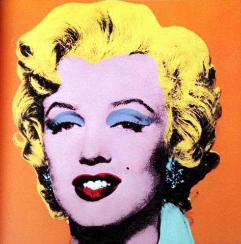
Pop art often takes as its imagery that which is currently in use in advertising. Product labeling and logos figure prominently in the imagery chosen by pop artists, like in the Campbell's Soup Cans labels, by Andy Warhol. Even the labeling on the shipping box containing retail items has been used as subject matter in pop art, for example in Warhol's Campbell's Tomato Juice Box 1964, (pictured below), or his Brillo Soap Box sculptures.
Origins
The origins of pop art in North America and Great Britain developed differently. In the United States, it marked a return to hard-edged composition and representational art as a response by artists using impersonal, mundane reality, irony and parody to defuse the personal symbolism and "painterly looseness" of Abstract Expressionism. By contrast, the origin in post-War Britain, while employing irony and parody, was more academic with a focus on the dynamic and paradoxical imagery of American popular culture as powerful, manipulative symbolic devices that were affecting whole patterns of life, while improving prosperity of a society. Early pop art in Britain was a matter of ideas fueled by American popular culture viewed from afar, while the American artists were inspired by the experience of living within that culture. Similarly, pop art was both an extension and a repudiation of Dadaism. While pop art and Dadaism explored some of the same subjects, pop art replaced the destructive, satirical, and anarchic impulses of the Dada movement with detached affirmation of the artifacts of mass culture. Among those artists seen by some as producing work leading up to Pop art are Pablo Picasso, Marcel Duchamp, Kurt Schwitters, and Man Ray. Some of the work of Alex Katz anticipated Pop art.

http://en.wikipedia.org/wiki/Pop_art 20/05/2014
Op art, also known as optical art, is a style of visual art that makes use of optical illusions.
"Optical art is a method of painting concerning the interaction between illusion and picture plane, between understanding and seeing." Op art works are abstract, with many of the better known pieces made in black and white. When the viewer looks at them, the impression is given of movement, hidden images, flashing and vibration, patterns, or alternatively, of swelling or warping.
The antecedents of Op art in terms of graphic and color effects can be traced back to Neo-impressionism, Cubism, Futurism, Constructivism and Dada.
Op art is perhaps more closely derived from the constructivist practices of the Bauhaus. This German school, founded by Walter Gropius, stressed the relationship of form and function within a framework of analysis and rationality. Students were taught to focus on the overall design, or entire composition, in order to present unified works. When the Bauhaus was forced to close in 1933, many of its instructors fled to the United States where the movement took root in Chicago and eventually at the Black Mountain College in Asheville, North Carolina, where Anni and Josef Alberswould come to teach.
The term first appeared in print in Time magazine in October 1964 in response to Julian Stanczak's show Optical Paintings at the Martha Jackson gallery, though works which might now be described as "op art" had been produced for several years previously. For instance, Victor Vasarely's painting, Zebras (1938), is made up entirely of curvilinear black and white stripes that are not contained by contour lines. Consequently, the stripes appear to both meld into and burst forth from the surrounding background of the composition. Also the early black and white Dazzle panels ofJohn McHale installed at the This Is Tomorrow exhibit in 1956 and his Pandora series at the Institute of Contemporary Arts in 1962 demonstrate proto-op tendencies.
http://en.wikipedia.org/wiki/Op_art 20/05/2014
Pop Art Artists
Banksy
Banksy is a pseudonymous England-based graffiti artist, political activist, film director, and painter.
His satirical street art and subversive epigrams combine irreverent dark humour with graffiti done in a distinctive stencilling technique. Such artistic works of political and social commentary have been featured on streets, walls, and bridges of cities throughout the world.
Banksy's work was born of the Bristol underground scene which involved collaborations between artists and musicians. According to author and graphic designer Tristan Manco and the book Home Sweet Home, Banksy "was born in 1974 and raised in Bristol, England. The son of a photocopier technician, he trained as a butcher but became involved in graffiti during the great Bristol aerosol boom of the late 1980s." Observers have noted that his style is similar to Blek le Rat, who began to work with stencils in 1981 in Paris, and members of the anarcho-punk band Crass, which maintained a graffiti stencil campaign on the London Tube System in the late 1970s and early 1980s. However Banksy himself stated on his website that in all actuality he based his work on that of 3D from Massive Attack, stating, "No, I copied 3D from Massive Attack. He can actually draw."
Known for his contempt for the government in labelling graffiti as vandalism, Banksy displays his art on public surfaces such as walls and even going as far as to build physical prop pieces. Banksy does not sell photos of street graffiti directly himself; however, art auctioneers have been known to attempt to sell his street art on location and leave the problem of its removal in the hands of the winning bidder. Banksy's first film, Exit Through the Gift Shop, billed as "the world's first street art disaster movie," made its debut at the 2010 Sundance Film Festival. The film was released in the UK on 5 March 2010. In January 2011, he was nominated for the Academy Award for Best Documentary for the film.
Banksy began as a freehand graffiti artist 1990–1994 as one of Bristol's DryBreadZ Crew (DBZ), with Kato and Tes. He was inspired by local artists and his work was part of the larger Bristol underground scene with Nick Walker, Inkie and 3D. From the start he used stencils as elements of his freehand pieces, too. By 2000 he had turned to the art of stencilling after realising how much less time it took to complete a piece. He claims he changed to stencilling whilst he was hiding from the police under a rubbish lorry, when he noticed the stencilled serial number and by employing this technique, he soon became more widely noticed for his art around Bristol and London.
Banksy's stencils feature striking and humorous images occasionally combined with slogans. The message is usually anti-war, anti-capitalist or anti-establishment. Subjects often include rats, apes, policemen, soldiers, children, and the elderly.
In July 2011 one of Banksy's early works Gorilla In A Pink Mask which had been a prominent landmark on the exterior wall of a former social club in Eastville for over ten years, was unknowingly painted over after the premises became a Muslim cultural centre.
On 19 June 2002, Banksy's first Los Angeles exhibition debuted at 33 1/3 Gallery, a tiny Silver Lake venue owned by Frank Sosa. The exhibition, entitled Existencilism, was curated by 33 1/3 Gallery, Malathion LA's Chris Vargas, Funk Lazy Promotions' Grace Jehan, and B+.
In 2003, at an exhibition called Turf War, held in a warehouse, Banksy painted on animals. Although the RSPCA declared the conditions suitable, an animal rights activist chained herself to the railings in protest. He later moved on to producing subverted paintings; one example is Monet's Water Lily Pond, adapted to include urban detritus such as litter and a shopping trolley floating in its reflective waters; another is Edward Hopper's Nighthawks, redrawn to show that the characters are looking at a British football hooligan, dressed only in his Union Flag underpants, who has just thrown an object through the glass window of the cafe. These oil paintings were shown at a twelve-day exhibition in Westbourne Grove, London in 2005.
Banksy, along with Shepard Fairey, Dmote and others created work at a warehouse exhibition in Alexandria, Sydney for Semi-Permanent in 2003. Approximately 1,500 people attended.
Andy Warhol
Andy Warhol (August 6, 1928 – February 22, 1987) was an American artist who was a leading figure in the visual art movement known as pop art. His works explore the relationship between artistic expression, celebrity culture and advertisement that flourished by the 1960s. After a successful career as a commercial illustrator, Warhol became a renowned and sometimes controversial artist. The Andy Warhol Museum in his native city, Pittsburgh, Pennsylvania, holds an extensive permanent collection of art and archives. It is the largest museum in the United States of America dedicated to a single artist.
Andy Warhol (né Andrej Varchola, Jr.) was born on August 6, 1928 in Pittsburgh, Pennsylvania. He was the fourth child of Ondrej Varchola (1889-1942)(americanized as Andrew Warhola,Sr.) and Júlia (née Zavacká, 1892–1972),[4] whose first child was born in their homeland and died before their move to the U.S. Andy had two older brothers Paul, born about 1923 and John born about 1925.
His parents were working-class Rusyn emigrants from Mikó (now called Miková), located in today’s northeastern Slovakia, part of the former Austro-Hungarian Empire. Warhol's father immigrated to the US in 1914, and his mother joined him in 1921, after the death of Warhol's grandparents. Warhol's father worked in a coal mine. The family lived at 55 Beelen Street and later at 3252 Dawson Street in the Oakland neighborhood of Pittsburgh. The family was Byzantine Catholic and attended St. John Chrysostom Byzantine Catholic Church. Andy Warhol had two older brothers – Pavol (Paul), the oldest, was born in Slovakia; Ján was born in Pittsburgh. Pavol's son, James Warhola, became a successful children's book illustrator. About 1939, he starts collecting autographed cards of film stars.
In third grade, Warhol had chorea, the nervous system disease that causes involuntary movements of the extremities, which is believed to be a complication of scarlet fever and causes skin pigmentation blotchiness. He became a hypochondriac, developing a fear of hospitals and doctors. Often bedridden as a child, he became an outcast at school and bonded with his mother. At times when he was confined to bed, he drew, listened to the radio and collected pictures of movie stars around his bed. Warhol later described this period as very important in the development of his personality, skill-set and preferences. When Warhol was 13, his father died in an accident.
As a teenager, Warhol graduated from Schenley High School in the year 1945. Though not medically diagnosed, Andy had dyslexia, which contributed to broadening his imagination for art. He perceived the world differently from other artists, who did not have this disorder, which was somewhat of a underlying gift. After graduating from high school, his intentions were to study art education at the University of Pittsburgh in hopes of becoming an art teacher, but his plans changed to enrolling in the Carnegie Institute of Technology to pursue an art career as a commercial illustrator. In 1949, he earned a Bachelor of Fine Arts in Graphic Design.
By the beginning of the 1960s, Warhol had become a very successful commercial illustrator. His detailed and elegant drawings for I. Miller shoes were particularly popular. They consisted mainly of "blotted ink" drawings (or monoprints), a technique which he applied in much of his early art. Although many artists of this period worked in commercial art, most did so discreetly. Warhol was so successful, however, that his profile as an illustrator seemed to undermine his efforts to be taken seriously as an artist.
Pop art was an experimental form that several artists were independently adopting; some of these pioneers, such as Roy Lichtenstein, would later become synonymous with the movement. Warhol, who would become famous as the "Pope of Pop", turned to this new style, where popular subjects could be part of the artist's palette. His early paintings show images taken from cartoons and advertisements, hand-painted with paint drips. Those drips emulated the style of successful abstract expressionists (such as Willem de Kooning). Warhol's first pop art paintings were displayed in April 1961, serving as the backdrop for New York Department Store Bronwit Teller's window display. This was the same stage his Pop Art contemporaries Jasper Johns, James Rosenquist and Robert Rauschenberg had also once graced. Eventually, Warhol pared his image vocabulary down to the icon itself – to brand names, celebrities, dollar signs – and removed all traces of the artist's "hand" in the production of his paintings.
To him, part of defining a niche was defining his subject matter. Cartoons were already being used by Lichtenstein, typography by Jasper Johns, and so on; Warhol wanted a distinguishing subject. His friends suggested he should paint the things he loved the most. It was the gallerist Muriel Latow who came up with the ideas for both the soup cans and Warhol's dollar paintings. On November 23, 1961 Warhol wrote Latow a check for $50 which, according to the 2009 Warhol biography, Pop, The Genius of Warhol, was payment for coming up with the idea of the soup cans as subject matter. For his first major exhibition Warhol painted his famous cans of Campbell's Soup, which he claimed to have had for lunch for most of his life. The work sold for $10,000 at an auction on November 17, 1971, at Sotheby's New York – a minimal amount for the artist whose paintings sell for over $6 million more recently.
He loved celebrities, so he painted them as well. From these beginnings he developed his later style and subjects. Instead of working on a signature subject matter, as he started out to do, he worked more and more on a signature style, slowly eliminating the hand-made from the artistic process. Warhol frequently used silk-screening; his later drawings were traced from slide projections. At the height of his fame as a painter, Warhol had several assistants who produced his silk-screen multiples, following his directions to make different versions and variations.
In 1979, Warhol was commissioned by BMW to paint a Group 4 race version of the then elite supercar BMW M1 for the fourth installment in the BMW Art Car Project. Unlike the three artists before him, Warhol declined the use of a small scale practice model, instead opting to immediately paint directly onto the full scale automobile. It was indicated that Warhol spent only a total of 23 minutes to paint the entire car. Warhol produced both comic and serious works; his subject could be a soup can or an electric chair. Warhol used the same techniques– silkscreens, reproduced serially, and often painted with bright colors – whether he painted celebrities, everyday objects, or images of suicide, car crashes, and disasters, as in the 1962–63 Death and Disaster series. The Death and Disaster paintings included Red Car Crash, Purple Jumping Man, and Orange Disaster.
The unifying element in Warhol's work is his deadpan Keatonesque style – artistically and personally affectless. This was mirrored by Warhol's own demeanor, as he often played "dumb" to the media, and refused to explain his work. The artist was famous for having said that all you need to know about him and his works is already there, "Just look at the surface of my paintings and films and me, and there I am. There's nothing behind it."
His Rorschach inkblots are intended as pop comments on art and what art could be. His cow wallpaper (literally, wallpaper with a cow motif) and his oxidation paintings (canvases prepared with copper paint that was then oxidized with urine) are also noteworthy in this context. Equally noteworthy is the way these works – and their means of production – mirrored the atmosphere at Andy's New York "Factory". Biographer Bob Colacello provides some details on Andy's "piss paintings":
Victor... was Andy's ghost pisser on the Oxidations. He would come to the Factory to urinate on canvases that had already been primed with copper-based paint by Andy or Ronnie Cutrone, a second ghost pisser much appreciated by Andy, who said that the vitamin B that Ronnie took made a prettier color when the acid in the urine turned the copper green. Did Andy ever use his own urine? My diary shows that when he first began the series, in December 1977, he did, and there were many others: boys who'd come to lunch and drink too much wine, and find it funny or even flattering to be asked to help Andy 'paint.' Andy always had a little extra bounce in his walk as he led them to his studio.
Warhol's first portrait of Basquiat (1982) is a black photosilkscreen over an oxidized copper "piss painting".
After many years of silkscreen, oxidation, photography, etc., Warhol returned to painting with a brush in hand in a series of over 50 large collaborative works done with Jean-Michel Basquiat between 1984 and 1986. Despite negative criticism when these were first shown, Warhol called some of them "masterpieces," and they were influential for his later work.
The influence of the large collaborations with Basquiat can be seen in Warhol's The Last Supper cycle, his last and possibly his largest series, seen by some as "arguably his greatest," but by others as “wishy-washy, religiose” and “spiritless." It is also the largest series of religious-themed works by any U.S. artist.
At the time of his death, Warhol was working on Cars, a series of paintings for Mercedes-Benz.
A self-portrait by Andy Warhol (1963–64), which sold in New York at the May Post-War and Contemporary evening sale in Christie's, fetched $38.4 million.
On May 9, 2012, his classic painting "Double Elvis (Ferus Type)" sold at auction at Sotheby's in New York for US$33 million dollars. With commission, the sale price totaled US$37,042,500, short of the $50 million that Sotheby's had predicted the painting might bring. The piece (silkscreen ink and spray paint on canvas) shows Elvis Presley in a gunslinger pose. It was first exhibited in 1963 at the Ferus Gallery in Los Angeles. Warhol made 22 versions of the "Double Elvis," nine of which are held in museums.
Warhol died in New York City at 6:32 a.m. on February 22, 1987. According to news reports, he had been making good recovery from a routine gallbladder surgery at New York Hospital before dying in his sleep from a sudden post-operative cardiac arrhythmia. Prior to his diagnosis and operation, Warhol delayed having his recurring gallbladder problems checked, as he was afraid to enter hospitals and see doctors. His family sued the hospital for inadequate care, saying that the arrhythmia was caused by improper care and water intoxication.
Warhol's body was taken back to Pittsburgh by his brothers for burial. The wake was at Thomas P. Kunsak Funeral Home and was an open-coffin ceremony. The coffin was a solid bronze casket with gold plated rails and white upholstery. Warhol was dressed in a black cashmere suit, a paisley tie, a platinum wig, and sunglasses. He was posed holding a small prayer book and a red rose. The funeral liturgy was held at the Holy Ghost Byzantine Catholic Church on Pittsburgh's North Side. The eulogy was given by Monsignor Peter Tay. Yoko Ono, John Richardson, and Nicholas Love were speakers. The coffin was covered with white roses and asparagus ferns. After the liturgy, the coffin was driven to St. John the Baptist Byzantine Catholic Cemetery in Bethel Park, a south suburb of Pittsburgh.
At the grave, the priest said a brief prayer and sprinkled holy water on the casket. Before the coffin was lowered, Paige Powell dropped a copy of Interview magazine, an Interview t-shirt, and a bottle of the Estee Lauder perfume "Beautiful" into the grave. Warhol was buried next to his mother and father. A memorial service was held in Manhattan for Warhol on April 1, 1987, at St. Patrick's Cathedral, New York.
Warhol's will dictated that his entire estate – with the exception of a few modest legacies to family members – would go to create a foundation dedicated to the "advancement of the visual arts". Warhol had so many possessions that it took Sotheby's nine days to auction his estate after his death; the auction grossed more than US$20 million.
In 1987, in accordance with Warhol's will, the Andy Warhol Foundation for the Visual Arts began. The Foundation serves as the official Estate of Andy Warhol, but also has a mission "to foster innovative artistic expression and the creative process" and is "focused primarily on supporting work of a challenging and often experimental nature."
The Artists Rights Society is the U.S. copyright representative for the Andy Warhol Foundation for the Visual Arts for all Warhol works with the exception of Warhol film stills. The U.S. copyright representative for Warhol film stills is the Warhol Museum in Pittsburgh. Additionally, the Andy Warhol Foundation for the Visual Arts has agreements in place for its image archive. All digital images of Warhol are exclusively managed by Corbis, while all transparency images of Warhol are managed by Art Resource.
The Andy Warhol Foundation released its 20th Anniversary Annual Report as a three-volume set in 2007: Vol. I, 1987–2007; Vol. II, Grants & Exhibitions; and Vol. III, Legacy Program. The Foundation remains one of the largest grant-giving organizations for the visual arts in the U.S.
http://art-bydens.blogspot.co.uk/2012/08/ten-famous-pop-art-artists.html 20/05/2014
http://blogs.edina.ac.uk/category/banksy/ 20/05/2012
Events during the 1950s
The Korean War (25 June 1950 – 27 July 1953) was a war between the Republic of Korea (South Korea), supported by the United Nations, and theDemocratic People's Republic of Korea (North Korea), at one time supported by China and the Soviet Union. It was primarily the result of the political division of Korea by an agreement of the victorious Allies at the conclusion of the Pacific War at the end of World War II. The Korean Peninsula was ruled by the Empire of Japan from 1910 until the end of World War II. Following the surrender of the Empire of Japan in September 1945, American administrators divided the peninsula along the 38th parallel, with U.S. military forces occupying the southern half and Soviet military forces occupying the northern half.
The failure to hold free elections throughout the Korean Peninsula in 1948 deepened the division between the two sides; the North established a communistgovernment, while the South established a right-wing government. The 38th parallel increasingly became a political border between the two Korean states. Although reunification negotiations continued in the months preceding the war, tension intensified. Cross-border skirmishes and raids at the 38th parallel persisted. The situation escalated into open warfare when North Korean forces invaded South Korea on 25 June 1950. In 1950, the Soviet Union boycotted the United Nations Security Council. In the absence of a veto from the Soviet Union, the United States and other countries passed a Security Council resolution authorizing military intervention in Korea.
The U.S. provided 88% of the 341,000 international soldiers which aided South Korean forces, with twenty other countries of the United Nations offering assistance. Suffering severe casualties within the first two months, the defenders were pushed back to the Pusan perimeter. A rapid U.N. counter-offensive then drove the North Koreans past the 38th parallel and almost to the Yalu River, when China entered the war on the side of North Korea. Chinese intervention forced the Southern-allied forces to retreat behind the 38th parallel. While not directly committing forces to the conflict, the Soviet Union provided material aid to both the North Korean and Chinese armies. The fighting ended on 27 July 1953, when the armistice agreement was signed. The agreement restored the border between the Koreas near the 38th Parallel and created the Korean Demilitarized Zone (DMZ), a 2.5-mile (4.0 km)-wide fortified buffer zone between the two Korean nations. Minor incidents still continue today.
From a military science perspective, the Korean War combined strategies and tactics of World War I and World War II: it began with a mobile campaign of swiftinfantry attacks followed by air bombing raids, but became a static trench war by July 1951.
http://en.wikipedia.org/wiki/Korean_War 20/05/2014
Colour Televisions
Color television is part of the history of television, the technology of television and practices associated with television's transmission of moving images in color video.
In its most basic form, a color broadcast can be created by broadcasting three monochrome images, one each in the three colors of red, green and blue (RGB). When displayed together or in rapid succession, these images will blend together to produce a full color image as seen by the viewer.
One of the great technical challenges of introducing color broadcast television was the desire to conserve bandwidth, potentially three times that of the existing black-and-white standards, and not use an excessive amount of radio spectrum. In the United States, after considerable research, the National Television Systems Committee[1]approved an all-electronic system developed by RCA which encoded the color information separately from the brightness information and greatly reduced the resolution of the color information in order to conserve bandwidth. The brightness image remained compatible with existing black-and-white television sets at slightly reduced resolution, while color televisions could decode the extra information in the signal and produce a limited-resolution color display. The higher resolution black-and-white and lower resolution color images combine in the eye to produce a seemingly high-resolution color image. The NTSC standard represented a major technical achievement.
Although all-electronic color was introduced in the U.S. in 1953,v high prices and the scarcity of color programming greatly slowed its acceptance in the marketplace. The first national color broadcast (the 1954 Tournament of Roses Parade) occurred on January 1, 1954, but during the following ten years most network broadcasts, and nearly all local programming, continued to be in black-and-white. It was not until the mid-1960s that color sets started selling in large numbers, due in part to the color transition of 1965 in which it was announced that over half of all network prime-time programming would be broadcast in color that fall. The first all-color prime-time season came just one year later.
Early color sets were either floor-standing console models or tabletop versions nearly as bulky and heavy, so in practice they remained firmly anchored in one place. The introduction of GE's relatively compact and lightweight Porta-Color set in the spring of 1966 made watching color television a more flexible and convenient proposition. In 1972, sales of color sets finally surpassed sales of black-and-white sets. Also in 1972, the last holdout among daytime network programs converted to color, resulting in the first completely all-color network season.
Color broadcasting in Europe was not standardized on the PAL format until the 1960s, and broadcasts did not start until 1967. By this point many of the technical problems in the early sets had been worked out, and the spread of color sets in Europe was fairly rapid.
By the mid-1970s, the only stations broadcasting in black-and-white were a few high-numbered UHF stations in small markets, and a handful of low-power repeater stations in even smaller markets such as vacation spots. By 1979, even the last of these had converted to color and by the early 1980s B&W sets had been pushed into niche markets, notably low-power uses, small portable sets, or use as video monitor screens in lower-cost consumer equipment, in the television production and post-production industry.
http://en.wikipedia.org/wiki/Color_television 20/05/2014
Events during the 1960s
Vietnam War
The Vietnam War , also known as the Second Indochina War, and known by the Vietnamese as the American War, was a Cold War-era proxy war that occurred in Vietnam, Laos, and Cambodia from December 1956 to the fall of Saigon on 30 April 1975. This war followed the First Indochina War and was fought between North Vietnam—supported by the Soviet Union, China and other communist allies—and the government of South Vietnam—supported by the United States and other anti-communist allies. The Viet Cong (also known as the National Liberation Front, or NLF), a lightly armed South Vietnamese communist common front directed by the North, fought a guerrilla war against anti-communist forces in the region. The People's Army of Vietnam (a.k.a. the North Vietnamese Army) engaged in a more conventional war, at times committing large units into battle. As the war wore on, the part of the Viet Cong in the fighting decreased as the role of the NVA grew. U.S. and South Vietnamese forces relied on air superiorityand overwhelming firepower to conduct search and destroy operations, involving ground forces, artillery, and airstrikes. In the course of the war, the U.S. conducted a large-scale strategic bombing campaign against North Vietnam, and over time the North Vietnamese airspace became the most heavily defended airspace of any in the world.
The U.S. government viewed American involvement in the war as a way to prevent a Communist takeover of South Vietnam. This was part of a widercontainment strategy, with the stated aim of stopping the spread of communism. According to the U.S. domino theory, if one state went Communist, other states in the region would follow, and U.S. policy thus held that accommodation to the spread of Communist rule across all of Vietnam was unacceptable. The North Vietnamese government and the Viet Cong were fighting to reunify Vietnam under communist rule. They viewed the conflict as a colonial war, fought initially against forces from France and then America, as France was backed by the U.S., and later against South Vietnam, which it regarded as a U.S. puppet state. Beginning in 1950, American military advisors arrived in what was then French Indochina. U.S. involvement escalated in the early 1960s, with troop levels tripling in 1961 and again in 1962. U.S. involvement escalated further following the 1964 Gulf of Tonkin incident, in which a U.S. destroyer clashed with North Vietnamese fast attack craft, which was followed by the Gulf of Tonkin Resolution, which gave the U.S. president authorization to increase U.S. military presence. Regular U.S. combat units were deployed beginning in 1965. Operations crossed international borders: bordering areas of Laos and Cambodia were heavily bombed by U.S. forces as American involvement in the war peaked in 1968, the same year that the Communist side launched the Tet Offensive. The Tet Offensive failed in its goal of overthrowing the South Vietnamese government but became the turning point in the war, as it showed that South Vietnam was unable to fend for itself against the North, despite many years of massive U.S. military aid. As the point of U.S. victory was indeterminate, U.S. ground forces were gradually withdrawn as part of a policy known as Vietnamization, which aimed to end American involvement in the war while transferring the task of fighting the Communists to the South Vietnamese themselves. Despite the Paris Peace Accord, which was signed by all parties in January 1973, the fighting continued.
In the U.S. and the Western world, a large anti-Vietnam War movement developed. This movement was both part of a larger Counterculture of the 1960s and also fed into it.
Direct U.S. military involvement ended on 15 August 1973 as a result of the Case–Church Amendment passed by the U.S. Congress. The capture of Saigon at the hands of the North Vietnamese Army in April 1975 marked the end of the war, and North and South Vietnam were reunified the following year. The war exacted a huge human cost in terms of fatalities (see Vietnam War casualties). Estimates of the number of Vietnamese service members and civilians killed vary from 800,000 to 3.1 million. Some 200,000–300,000 Cambodians, 20,000–200,000 Laotians, and 58,220 U.S. service members also died in the conflict.
http://en.wikipedia.org/wiki/Vietnam_War 20/05/2014
Primary Research - Visit to gallary
I decided to go to London on the 6th February to Paul Smith and the Tate Modern, to go and see some of the Artists work in person.
Picture taken at the Paul Smith Design Museum
I didn't manage to get any pictures inside of the Tate Modern which was abit of a shame but I was happy i could get a picture of the mini at the Paul Smith Design Museum, it is a iconic piece of his work.
I really enjoyed going to London and looking around the Paul Smith Design Museum and the Tate Modern, I would definitely go back again in the future. It was good to see other peoples work up close and in person not just images on the internet. If I was to go again I would definitely set aside more time to have a better look around both of the places.
I also went to the V&A and the National History Museum in London to look at other work of artists, it was a really good experience as I have never been to either of the museums.
Essay
Introduction
I have decided to look into ‘Pop Art’, which emerged in the mid-1950s in Britain and in the late 1950s in the United States. Pop art presented a challenge to traditions of fine art by including imagery from popular culture such as advertising, news, etc. In pop art, material is sometimes visually removed from its known context, isolated, and/or combined with unrelated material. The concept of pop art refers not as much to the art itself as to the attitudes that led to it.
Pop Art began in the mid 1950s and reached its peak in the 1960s. I was a revolt against previaling orthodoxies in art and life and can be seen as one of the first manifestations of postmodernism. Sources pop artists used for their work included Hollywood movies, advertising, packaging, pop music and comic books. Modernist critics were horriefied by the pop artists' use of such low subject matter and by their apparently uncritical treatment of it. In fact pop both took art into new areas of subject matter and developed new ways of presenting in it art.
Chief artists in America were Roy Lichtenstein, Claes Oldenberg, Andy Warhole; in Britain, Peter Black, Patrick Caulfield, Richard Hamilton, David Hockney, Allen Jones, Colin Self. In Europe a similar moment was called nouveau realisme (new realism)
Pop art employs aspects of mass culture, such as advertising, comic books and mundane cultural objects. It is widely interpreted as a reaction to the then-dominant ideas of abstract expressionism, as well as an expansion upon them. And due to its utilization of found objects and images it is similar to Dada. Pop art is aimed to employ images of popular as opposed to elitist culture in art, emphasizing the banal or kitschy elements of any given culture, most often through the use of irony. It is also associated with the artists' use of mechanical means of reproduction or rendering techniques.
Pop art and minimalism are considered to be art movements that precede postmodern art, or are some of the earliest examples of Post-modern Art themselves.
Pop Art Artists
There are a selection of inspirational Artists throughout the 1950s, many who had a big impact on the Pop Art movement. The most inspirational Artist is Andy Warhol, he was an a American Artist who was a leading figure in pop art. His work explore the relationship between artistic expression, celebrity culture and advertisement that flourished by the 1960s.
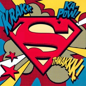
Roy Lichtenstein (October 27, 1923 – September 29, 1997) was a prominent American pop artist. During the 1960s, his paintings were exhibited at the Leo Castelli Gallery in New York City and along with Andy Warhol, Jasper Johns, James Rosenquist and others he became a leading figure in the new art movement. His work defined the basic premise of pop art better than any other through parody. Favouring the old-fashioned comic strip as subject matter, Lichtenstein produced hard-edged, precise compositions that documented while it parodied often in a tongue-in-cheek humorous manner. His work was heavily influenced by both popular advertising and the comic book style. He described Pop Art as, "not 'American' painting but actually industrial painting".
I personally feel that Roy Lichtenstein was one of the most influential Artists around during the Pop Art era, his work set the Art work to that certain time period.
During the 1950’s there were many different and influential world events, many of them had effects on the certain art period during the 10-year period. The first major one being is the Korean War, I don’t think it had a major effect on Pop Art but it would have influenced it in some way. Colour Television was introduced during 1951, On June 25, CBS broadcast the very first commercial color TV program. Unfortunately, nearly no one could watch it on their black-and-white televisions. Despite these early successes with color programming, the adoption to color television was a slow one. It wasn't until the 1960s that the public began buying color TVs in earnest and in the 1970s the American public finally started purchasing more color TV sets than black-and-white ones. However, sales of new black-and-white TV sets lingered on even into the 1980s.
(Source -
http://en.wikipedia.org/wiki/Color_television) 20/05/2014
These two major events during the 1950s have influenced Pop Art in a great way, with the introduction of Colour TV designs could do a lot more with their work. The Korean war didn't have a great effects but i feel it still effected Pop Art style in one way or the other.
The reason I decided to choose Pop Art is because I really like style, it has influenced my own work in different ways. I really like the way that Pop Art shows advertising in a complete different way to other forms of advertising, i personally feel like it makes it more interesting. It would make people more interested in the certain advert because of the unique style and the eye catching design of advertising during pop art. The artwork is also very unique, they use very bright eye catching colours to make it stand out a lot compared to other art movements. Pop Art wasn't only in the 1950's in fact that was just the beginning, it continued into the 1960's also.
The movement was marked by a fascination with popular culture reflecting the affluence in post-war society. It was most prominent in American art but soon spread to Britain. In celebrating everyday objects such as soup cans, washing powder, comic strips and soda pop bottles, the movement turned the commonplace into icons.
----------------------------------------------------------------------------------------------------------------------------------
Pop Art is a direct descendant of Dadaism in the way it mocks the established art world by appropriating images from the street, the supermarket, the mass media, and presents it as art in itself.
Artists such as Jasper Johns and Robert Rauschenberg took familiar objects such as flags and beer bottles as subjects for their paintings, while British artist Richard Hamilton used magazine imagery. The latter’s definition of Pop Art – “popular, transient, expendable, low-cost, mass-produced, young, witty, sexy, gimmicky, glamorous, and Big Business” – stressed its everyday, commonplace values.
It was Andy Warhol, however, who really brought Pop Art to the public eye. His screen prints of Coke bottles, Campbell’s soup tins and film stars are part of the iconography of the 20th century. Pop Art owed much to dada in the way it mocked the established art world. By embracing commercial techniques, and creating slick, machine-produced art, the Pop artists were setting themselves apart from the painterly, inward-looking tendencies of the Abstract Expressionist movement that immediately preceded them. The leading artists in Pop were Andy Warhol, Roy Lichtenstein, Roy Hamilton, Jasper Johns, Robert Rauschenberg and Claes Oldenburg.